
Creating Skins with Resources
Skins are created using resource elements form the Resource Library. This is done by dragging and dropping a resource from the library into the Skin workspace. The elements are then combined into a theme which ControlDesigner Software uses to simulate the functionality of a control.
Skin Preview
The Skin workspace displays a preview of how a control will look using the selected skin and all of the specified elements. In the example below, a color button skin from the Studio theme is selected and shown in the Skin workspace preview area.
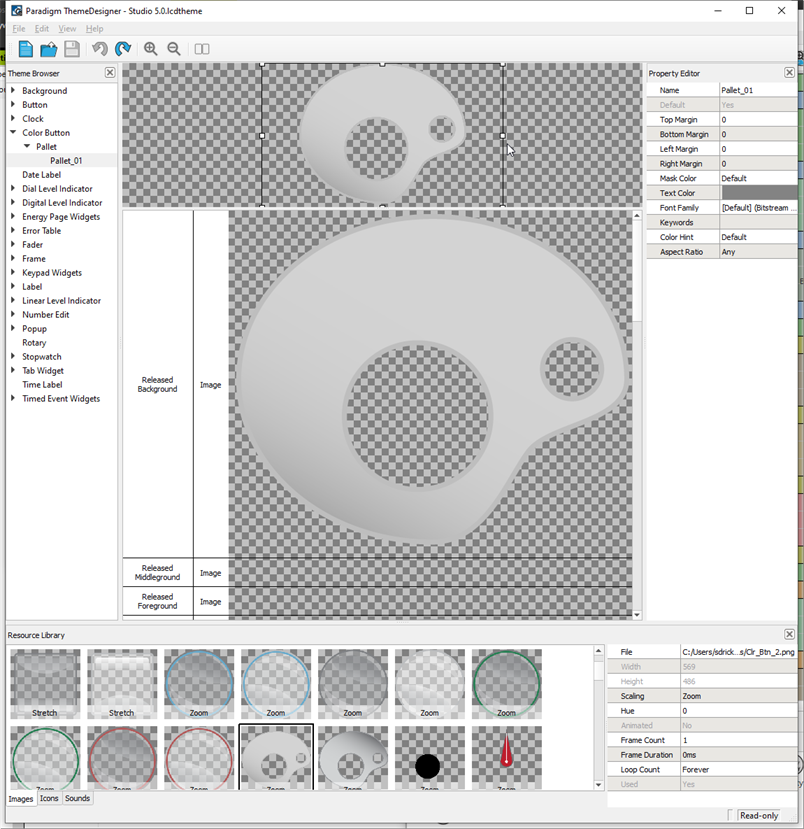
The elements of this button are detailed in the elements table next to the button.
Tip: You can demonstrate how the control will display at different scaled sizes by clicking and dragging the resize handles at the edges of the control in the workspace. You can also simulate how a button looks as it is in its pressed state by clicking the control, and how faders behave throughout its extents.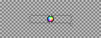
Skin Element Table
The Skin Element Table is where you combine image and sound resources into the skins. After selecting a skin from the Theme Browser, the Skin Element Table will show a row for each element the skin may contain, depending on the control type.
To define an image or sound resource to an element, drag the resource from the Image or Sound Resource Library and drop them onto the desired row for that skin element.
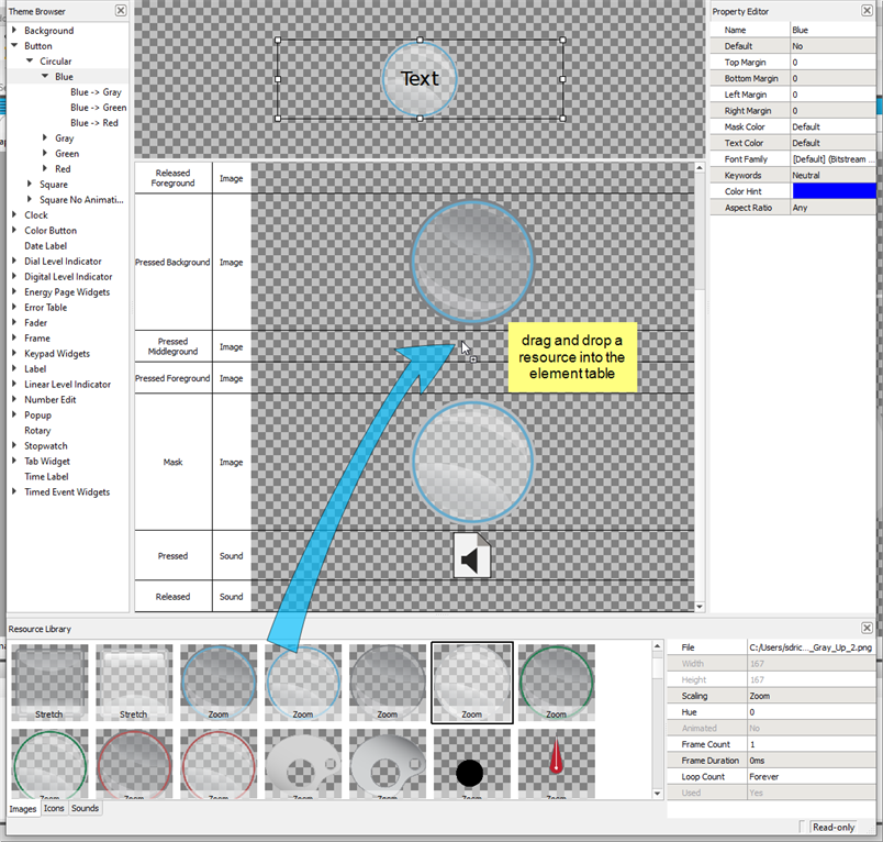
Blank rows have no resource assigned to them. You are not required to assign a resource to every element of a skin. When a skin is rendered, if an image resource is undefined, nothing is drawn for that element. If a sound resource is undefined, no sound will be played.