
Images Tab
Images tab found in the Resource Library displays the collection of all image resources that are included within a theme and are used as elements of skins. Images can be added to the theme once and their properties set once; and then reused in multiple skins.
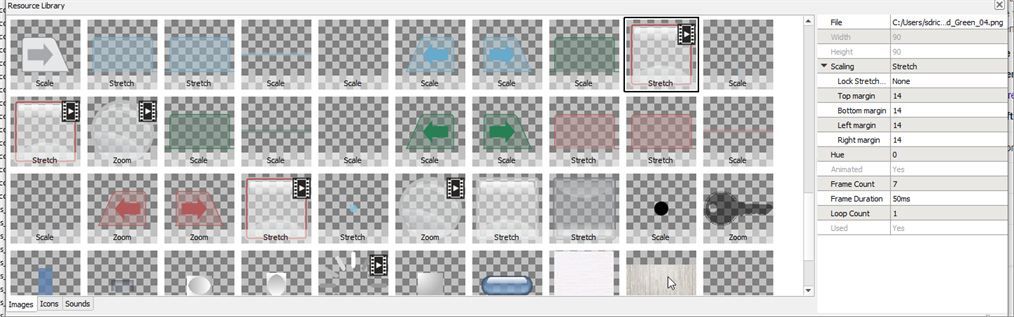
When an image resource is selected, its properties are displayed in the Resource Editor, located to the right of the image library. See Setting Image Resource Properties.
The image tab supports files of type .png, .jpg, .jpeg, .bmp, and .gif format, as well as animated .gif and filmstrip .png files for animated resources.
Tip: Be as frugal as creativity allows! A given theme will contain all files added to the resource library. To avoid a bloated theme file size, only include those resources that are used to create skins. Choose image size carefully, remove any unnecessary files, and when possible reuse resources for multiple skins.
Using the Images Tab
Add, Remove, Duplicate an Image
To add one or more image resources, drag and drop an image from a local folder into the images tab or right-click in the library and select "Add Resource..." from the context menu. An "Add Image" dialog will display for selection of the image file.
To remove an image resource, select the image and press (Delete) from your alphanumeric keyboard or right-click on the image and select "Remove Resource" from the context menu.
CAUTION: Removing a resource will remove it from ALL skin elements that use it.
To duplicate an image resource, right-click on a resource and select "Duplicate Resource" from the context menu. The duplicate will copy the properties of the original resource as well.
Tip: The duplicate function can be useful to create different colored variations of the same image. After applying properties including scaling properties in the "Resource Editor", duplicate the resource a number of times and change the hue to create colored variations of the image.
Preview an Image Resource
To preview an image resource at higher resolution, double-click on the image thumbnail. The full image will display in the Resource Library.
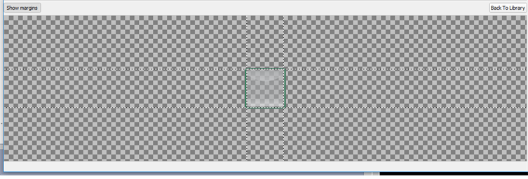
From this view you can also select the [Show Margins] button to view any margins that are associated with the resource when the scaling property is set "stretch". To close the preview and return to the Images library, select the [Back to Library] button. For more information on margins, see Setting Margins in Stretch mode.
Setting Image Resource Properties
There are several properties available to edit how a resource is used and how it will appear within a skin. These properties are displayed for edit in the "Resource Editor" when an image resource is selected.
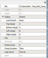
- File - the file location of the original resource
- Width - the width of the resource in pixels (read-only)
- Height - the height of the resource in pixels (read-only)
- Scaling - how the image will be resized (see Image Resource Scaling below)
-
Hue - hue offset (in degrees) of the image. This property is used when creating a number of different color variations of a skin without having to import a different image for each color required.
Tip: Example of use - Import a single red LED image, duplicate the image and then set the offset hue of that image to create green, blue and yellow variations.
- Margins - set the Top, Bottom, Left, and Right Margins of the
- Animated - indicates whether the resource is animated (read-only)
- Frame count - the number of frames in a composite animated image ( Animation)
- Frame Duration - the length of time each frame is displayed in milliseconds
- Loop Count - the iterations that the image animation will run
- Used - indicates whether the selected resource is used in the current theme (read only)
Image Resource Scale Mode
When an image resource is drawn into a target rectangle that differs from the resource's native size, you can specify how the image is scaled or resized to fit within the destination.
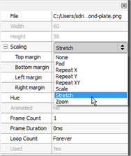
There are a number of options available for selection:
- None - the image is drawn in the top left of the target rectangle at its native size
- Pad - the image is drawn in the center of the target rectangle at its native size
- Repeat X - the image is repeated horizontally to fill the target rectangle, starting at the left of the target rectangle. Each repeat is scaled to the height of the target rectangle.
- Repeat Y - the image is repeated vertically to fill the target rectangle, starting at the top of the target rectangle. Each repeat is scaled to the width of the target rectangle.
- Repeat XY - the image is tiled over the target rectangle, starting at the top left of the target rectangle and every tile is the native size of the image.
- Scale - the image is scaled to fill the target rectangle without maintaining the aspect ratio of the native resource
- Stretch - four margin properties are used to specify which parts of the image should be drawn at their native size and which parts should be scaled to fit the target rectangle. This setting is useful when a resource has rounded edges or corners to maintain the curves while allowing the resource to be scaled larger or smaller. See Using Stretch for Resource Scaling.
- Zoom - the image is scaled to fill the target rectangle, maintaining the aspect ratio of the native resource
Using Stretch for Resource Scaling
For reference, a base image as shown below is considered:
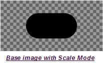
In the images below, the base image has been scaled using the "Scale" option.
When the resource is rendered into a wide but short area, the aspect ratio of the corners is lost.
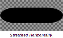
Even when the resource is rendered into a larger area that happens to maintain aspect ration, the corners can appear jagged from pixelation.
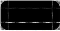
Using the "Stretch" mode for scaling, additional properties display:
- Lock Stretch - this setting enables the ability to stretch the image width or height separately or together. Settings include None, Width, and Height.
- Margins (Top, Bottom, Left, and Right) - these properties set margins for the image resource that can preserve image edge and corner detail. Image data between the margins and extents of the image are not manipulated, while the central area within the margins is rendered with scaled image data. The images below are the same base image as the above examples, but with margin properties specified.
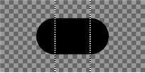
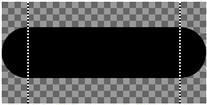
Applying margins allows the original corner geometry to be used, and fills in intermediate area with scaled image data.
Setting Margins in Stretch mode
To set which parts of the image must not be resized, select an image resource and set the "Scaling" property to "Stretch". Four additional properties will display for edit including top margin, bottom margin, left margin and right margin. These property values are the number of pixels from the edge of the source image that must be drawn at the same resolution when the image is resized.
Tip: The margin lines can be previewed on a resource by double clicking the resource in the library and selecting the [Show Margins] button. In "Preview" you can also adjust the margins by clicking and dragging on the margin lines.