
Icons Tab
The "Icons" tab of the Resource Library is the collection of all icon resources that are included within a theme and are used as elements of skins. Icons can be added to the theme once and their properties set once; and then reused in multiple skins. A selected icon displays its properties in the Resource Editor.
Icons are typically shown inside controls, for example, buttons and labels. A configuration designer can choose to use text, an icon, or both, inside a control within ControlDesigner.
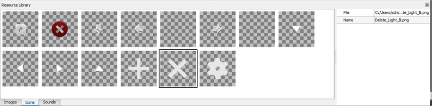
Note: The images displayed in the graphic above are a representative example of the Industrial theme "Icons" library. Industrial is a standard theme included with ControlDesigner. A new theme will be void of any library resources as the user provides all images, icons, sounds, and property settings.
Using the Icons Tab
Add, Remove, Duplicate an Icon
To add one or more icon resources, drag and drop an icon image from a local folder into the icons tab or right-click in the library and select "Add Resource..." from the context menu. An "Add Icon" dialog will display for selection of the image file.
To remove a icon resource, select the icon image and press (Delete) from your alphanumeric keyboard or right-click on the icon image and select "Remove Resource" from the context menu.
CAUTION: Removing a resource will remove it from ALL skin elements that use it.
To duplicate an icon resource, right-click on the icon image and select "Duplicate Resource" or select Duplicate Resource (Copy File) from the context menu.
Tip: The duplicate function can be useful to create different colored variations of the same image. After applying properties including scaling properties in the "Resource Editor", duplicate the resource a number of times and change the hue to create colored variations of the image.
Icon Resource Properties
- File - the designated file path to the resource.
- Name - the name of the resource. The name will appear in ControlDesigner for selection and should be descriptive of what the icon actually represents.