Skins
A skin is a graphical look for a specific control type that consists of a number of elements. Elements of the skin may have a images and sounds associated. When rendering a control, those elements of the control's skin that have an image associated, will be drawn as part of the control.
Add a Skin Set
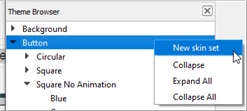
From the Theme Browser, right-click on the element that the new skin set will be created within and select "New skin set" from the context menu.
Add a Skin
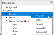
From the Theme Browser, right-click on the skin set that the new skin will be created within and select "New skin" from the context menu.
Delete a Skin
From the Theme Browser right-click on the skin you wish to delete then select "Delete" from the context menu.
Duplicate a Skin
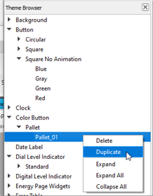
Duplicating a skin provides a way to create a similar skin from an existing skin. From the Theme Browser right-click on the skin you wish to duplicate select "Duplicate" from the context menu.
Edit a Skin
To edit a skin, select it from within the Theme Browser. The selected skin properties are displayed in the Property Editor and the elements of the skin are displayed in the Skin Element Table.
Skin Properties
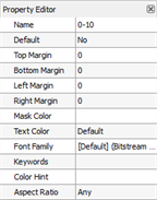
- Name - the name used by ControlDesigner Software to identify the skin.
- Default - the default skin will be assigned to a control when a new object is added into ControlDesigner Software.
Note: If the "Default" property is set to "No" and you change it to "Yes", the selected skin becomes the default skin for that skin type (including all skin sets). If this property is set to "Yes", it cannot be changed to "No" as there must always be a default skin. To change the default skin, you must choose a different skin and set it's Default property to "Yes".
- Top margin - the distance the content remains from the top of the control (see content margins).
- Bottom margin - the distance the content remains from the bottom of the control (see content margins)
- Left margin - the distance the content remains from the left of the control (see content margins)
- Right margin - the distance the content remains from the right of the control (see content margins)
- Mask Color - the default mask color (see mask color)
- Text Color – the default Text Color used for any text added to a control
- Font Family - the default font family used for any text added to a control
- Keywords – Keywords are used to automatically associate states to indicator functions for controls
- Color Hint - used to assign similar skins to controls when changing themes in a Touchscreen configuration (see Color Hint)
- Aspect Ratio - this setting is used to constrain a skin set to be in a certain height to width ratio including "Portrait" or "Landscape", "Square" or "Any". Any graphic that is added to a skin must conform to the setting
Content margins
Content margins are used to keep the content of a skin, typically the text of a button, away from the edges of the skin. This would be common in a skin with rounded corners or borders. Content margins are set in the Property Editor when a skin is selected. You can set independent values for top, bottom, left and right margins.
Mask Color
When a control is set to use a skin that defines an image for its mask element, and the mask color has not been overridden in the state properties of ControlDesigner Software, the color set within the "Mask Color" property of the skin will be used to render the mask (see Mask Element). The mask color may only be visible if the resources for the selected skin support transparency.
Text Color
When a control's text color has not been overridden in the state properties of ControlDesigner Software, the color set within the "Text Color" property of the skin will be used to render the text on the control.
Keywords
Keywords are used to define which skin is used by default in LightDesigner Software for indicator states within the configuration. Keywords are set in the Property Editor of the selected skin.
Available keywords are:
- On – used to show active, positive, or true indicator state
- Off – used to show inactive, negative, or false indicator state
- Neutral – used to show intermediate indicator state
- Warning – used to show flashing or warning indicator state
- Lockout – used to show the Lockout state
- Override – used to show the Override state
- Open – used to show Wall Open state
- Close – used to show Wall Closed state
Note: Keywords must be matched exactly to be effective. Each skin can have multiple keywords assigned.
Color Hint
Color hint is used to assign similar skins to controls when changing themes in a Touchscreen configuration. When no similar skin is found, the keyword will be used to find a similar control. When no similar keyword is can be found, the color hint setting will be used to find a similar control, based on its color. The following RGB values are used in default themes for color hint, based on the hue of the control:
- Red - 255, 0, 0
- Orange - 255,170, 0
- Yellow - 255, 255, 0
- Green - 0, 255, 0
- Light Blue - 0, 170, 255
- Blue - 0, 0, 255
- Purple - 255, 0, 255
- White - 255, 255, 255
- Black -- 0 0, 0
- Gray - 170, 170, 170
- Blank - 1, 1, 1