
Token Button
Token Buttons are skins used by keypads and keypad passcodes in ControlDesigner.
Note: When a theme has a defined Keypad Button skin, that will be used as the default skin for keypads and keypad passcodes. When none are defined, the Token Button skins will be used.
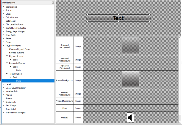
Token Button skin elements include:
- Released Background - drawn underneath any text and/or icons when the button is not pressed
- Released Middleground - drawn in between the background and foreground when the button is not pressed
- Released Foreground - drawn above any text and/or icons when the button is not pressed down
- Pressed Background - drawn underneath any text and/or icons when the button is pressed down
- Pressed Middleground - drawn between the background and foreground when the button is pressed
- Pressed Foreground - drawn above any text and/or icons when the button is pressed down
- Mask- see Mask Element
- Pressed (Sound) - the sound played when the button is pressed
- Released (Sound) - the sound played when the button is released