Tab Widget
Tab Widgets can be used to create multiple control pages within a single touchscreen page. When tabs are used, multiple tabs will appear on a control page for navigation.
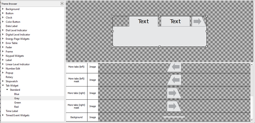
The following skin elements are supported by the Tab Widget:
- Tab (active) - the header of the currently active tab
- Tab (active) mask - see Mask Element
- Tab (inactive) - the header of any inactive tab
- Tab (inactive) mask - see Mask Element
- No tab - used to fill any space in the tab bar that is unused by tab headers
- No tab mask - see Mask Element
- More tabs (left) - if there are more tabs than will fit in the header, this will indicate there are more tabs to the left of the visible tabs
- More tabs (left) mask - see Mask Element
- More tabs (right) - if there are more tabs than will fit in the header, this will indicate there are more tabs to the right of the visible tabs
- More tabs (right) mask - see Mask Element
- Background - drawn behind any controls that exist within a tab. Tab backgrounds overlap the Page background
Note: When designing a tab skin, it is worth considering that ControlDesigner can be used to choose the tab position on the top or bottom of the page. This may affect how you use highlights in the skin. The tab skin will treat the images as if the tabs are positioned at the top of the control. If ControlDesigner specifies that the tabs are on bottom, the images are rotated accordingly.