
Color Button
The Color Button is used to activate a "Color Picker" on the Paradigm Touchscreen so a user can pick a specific color for the assigned color mixing fixture(s).
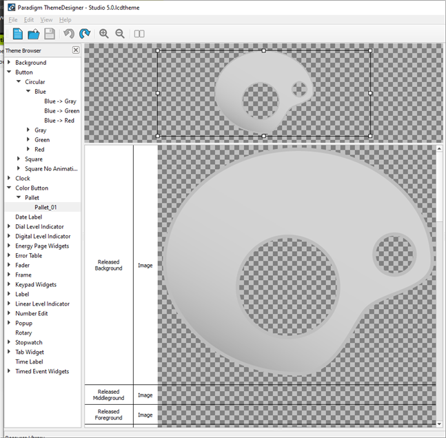
The following skin elements are supported by the Color Button:
- Released Background- drawn underneath any text and/or icons when the button is not pressed.
- Released Middleground - drawn between the background and foreground when the button is not pressed.
- Released Foreground - drawn above any text and/or icons when the button is not pressed down.
- Pressed Background - drawn underneath any text and/or icons when the button is pressed down.
- Pressed Middleground - drawn between the background and foreground when the button is pressed.
- Pressed Foreground - drawn above any text and/or icons when the button is pressed down.
- Color Mask - same functionality as a "mask" except this element defines the area that a representation of the output color assigned to a fixture will be displayed
- Mask – see Mask Element
- Pressed (Sound) - the sound played when the button is pressed.
- Released (Sound) - the sound played when the button is released.