
Button
Button skins are a primary control element in touchscreen configurations.
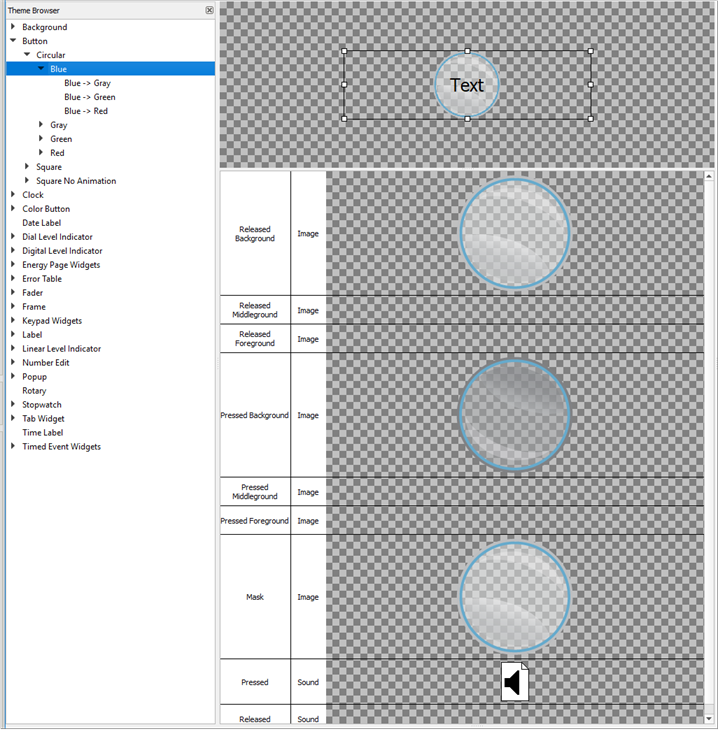
The following skin elements are supported by buttons:
- Released Background - drawn underneath any text and/or icons when the button is not pressed.
- Released Middleground - drawn in between the background and foreground when the button is not pressed.
- Released Foreground - drawn above any text and/or icons when the button is not pressed down.
- Pressed Background - drawn underneath any text and/or icons when the button is pressed down.
- Pressed Middleground - drawn between the background and foreground when the button is pressed.
- Pressed Foreground - drawn above any text and/or icons when the button is pressed down.
- Mask- see Mask Element
- Pressed (Sound) - the sound played when the button is pressed.
- Released (Sound) - the sound played when the button is released.
Tip: A typical button skin will define at least the released background and pressed background elements, with the pressed element indicating that the button is in some way being interacted with (example, showing a drop shadow). The foreground and middleground elements may be used to add highlights to the button.