Tab Properties
Tabs are provided with a set of properties located in the Property Editor that allow you to specify how a tab should look (graphically) including size, color, and navigation timing.
Tabs are provided with the same Basic Properties that other controls share. Additional Tab control specific properties include:
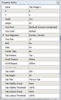
- Text Font - the font used to display the "Tab Title"
- Text Color - the color of the text displaying the "Tab Title"
- Text Alignment - the vertical and horizontal alignment of the text displaying the "Tab Title"
- Text Size - the height of the text (in pixels)
- Bold - when enabled, applies the bold character format to the Tab Title
- Italic - when enabled, applies the italic character format to the Tab Title
- Center Tabs – specify whether ControlDesigner will centers tabs in full the width of the drawn tab string
- Tab Position - specify the text location on the tab.
- Scroll Timeout – sets how long the more tabs button waits to begin changing tabs when held down
- Scroll Repeat – sets the interval at which more tabs are displayed when the more tabs button is held down
- Current Tab - (read-only) indicates which tab in the string is selected and therefore which tabs properties are being displayed
- Tab Width - the width of the current tab (in pixels)
- Tab Title - the text displayed on the current tab
- Tab Visibility Group - the visibility group to which this tab belongs. See Lockout and Visibility and Hiding and Disabling Controls.
- Tab Visibility Threshold - the threshold at which the tab becomes hidden. See Lockout and Visibility and Hiding and Disabling Controls.
- Tab Lockout Group - the lockout group to which the tab belongs. See Lockout and Visibility and Hiding and Disabling Controls.
- Tab Lockout Threshold - the lockout threshold at which the tab becomes disabled. See Lockout and Visibility and Hiding and Disabling Controls.